Construction Company Logo

Coquito - selling business logo

Logo for a mobile auto detailing business. Hand-drawn car, imported onto a vector format on Illustrator.
Accounting Business Logo

Housekeeping Business Logo

The Logo Making Process
Anner Construction Corp.
Anner is a local new Construction Business that was in need for a logo and business cards. At the first consultation, the owner explained to me that he wanted something with a construction crane and the statue of liberty.
In the first stage, I strictly work with black and white to focus on composition and design.

However, after seeing the designs, the owner realized he doesn't really work with cranes or in the city (primarily cement and based in Long Island), and he preferred something simpler.
So I restarted from scratch and did simpler designs, while playing with the "A" In the name as a background to frame the logo.
So I restarted from scratch and did simpler designs, while playing with the "A" In the name as a background to frame the logo.
I also started experimenting with color, in order for the client to start having an idea for the final product. He specifically told me from stage one he wanted to use blues and/or indigo.

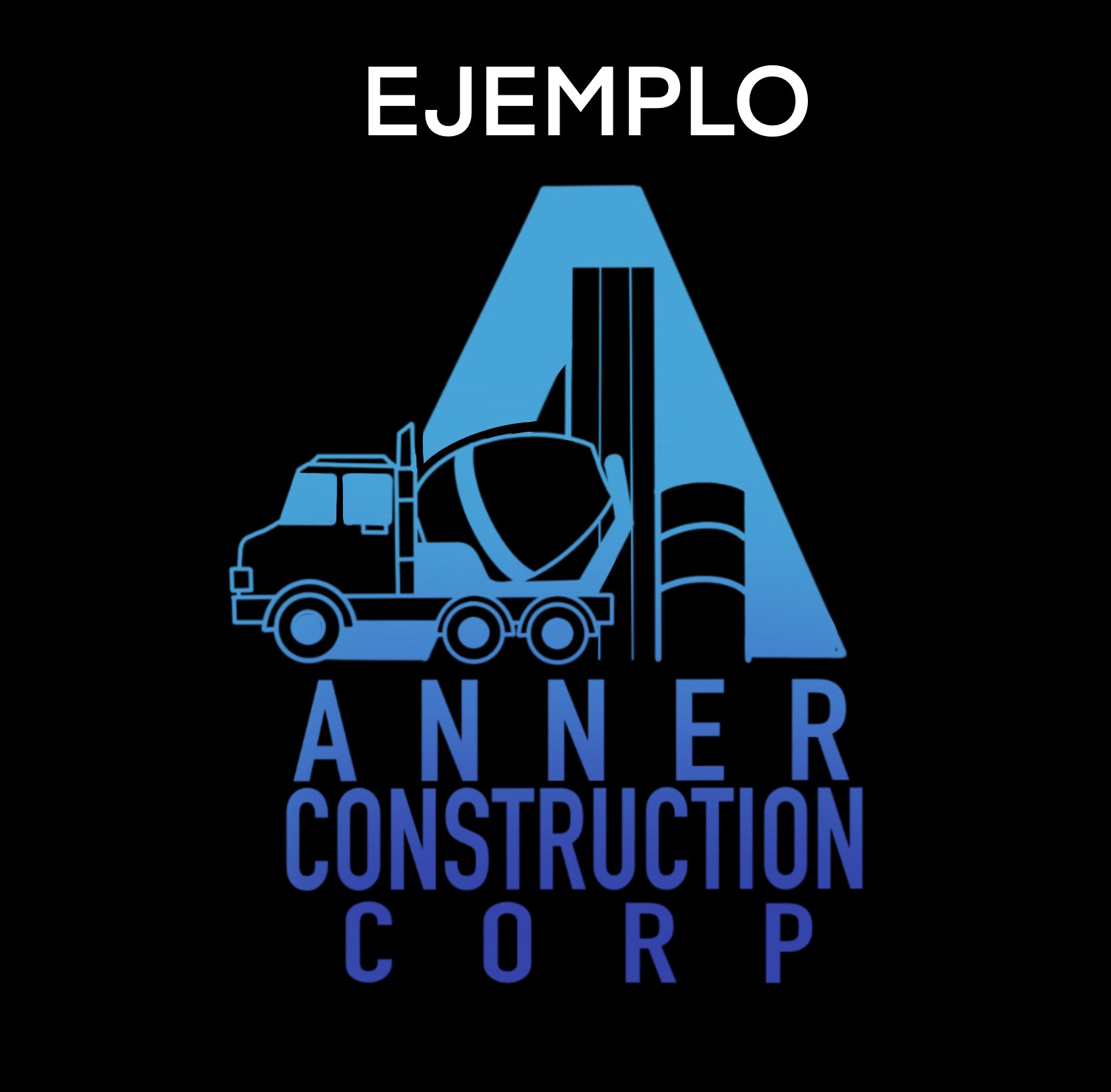
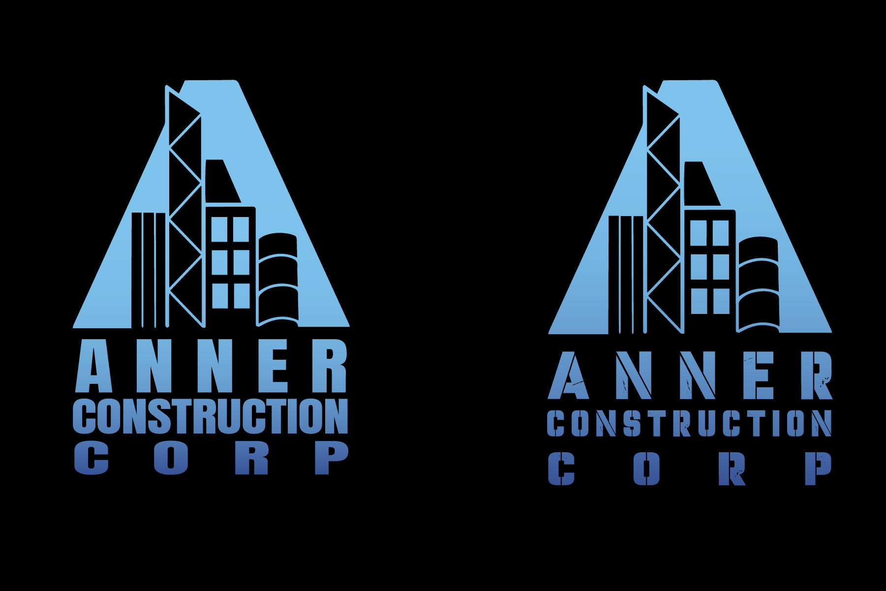
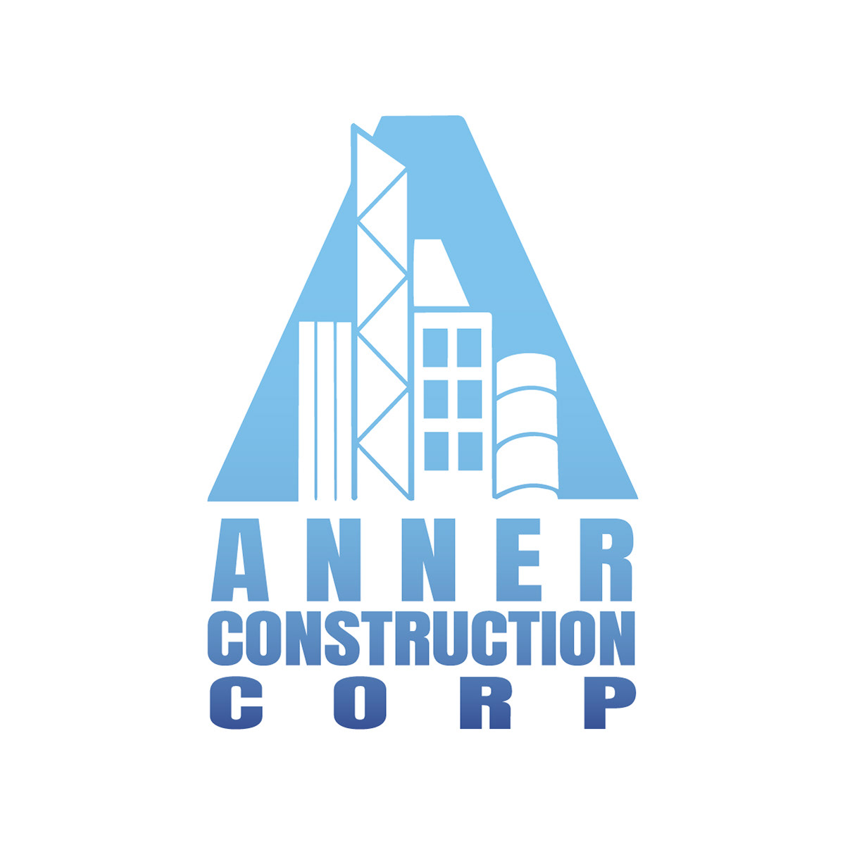
He ultimately chose the bottom left design, which I cleaned up, vectorized, and added two different typefaces. He chose the left typeface (Impact, Regular), and after confirmation, we were left with the final logo.
My Ownee Coquito
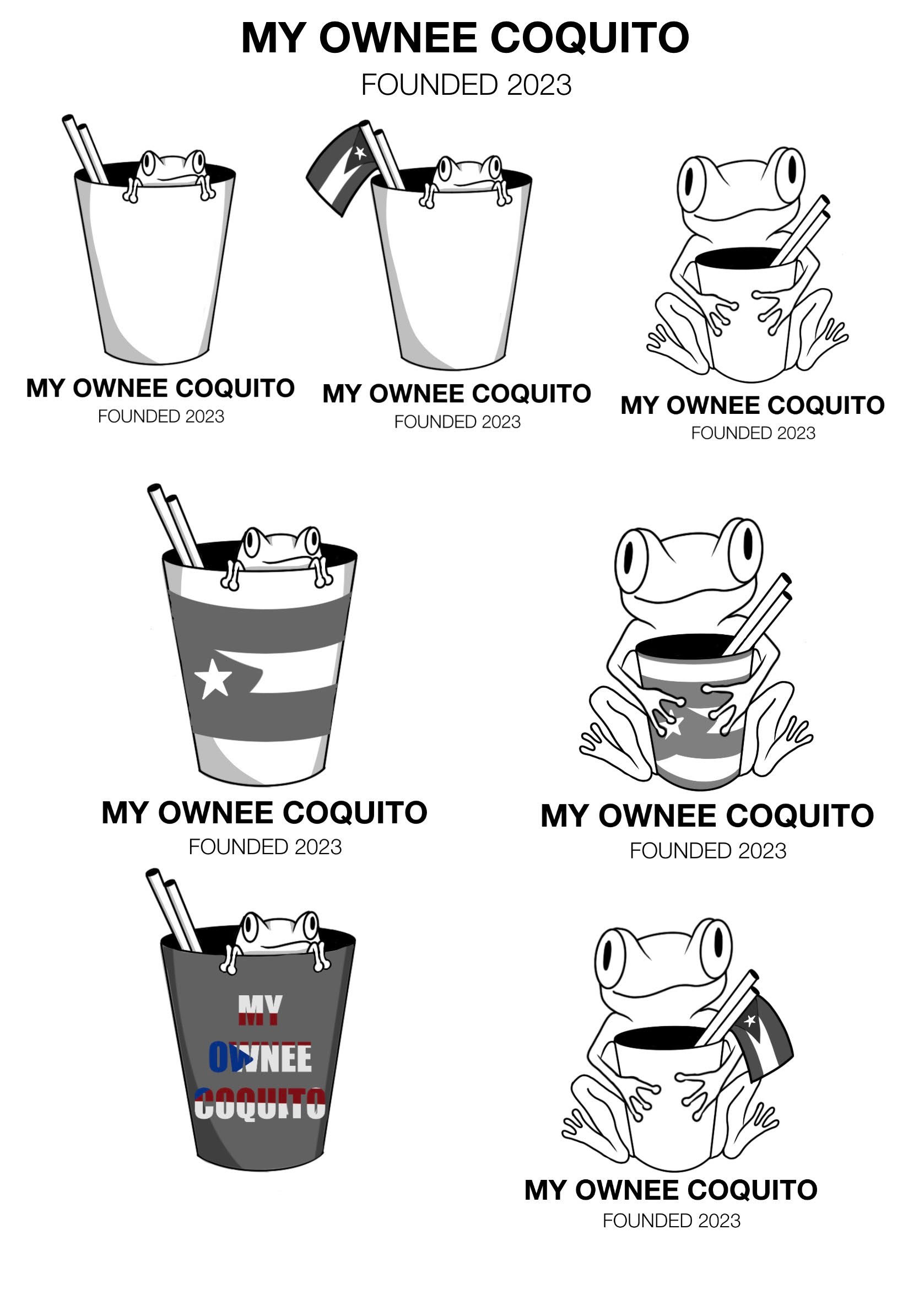
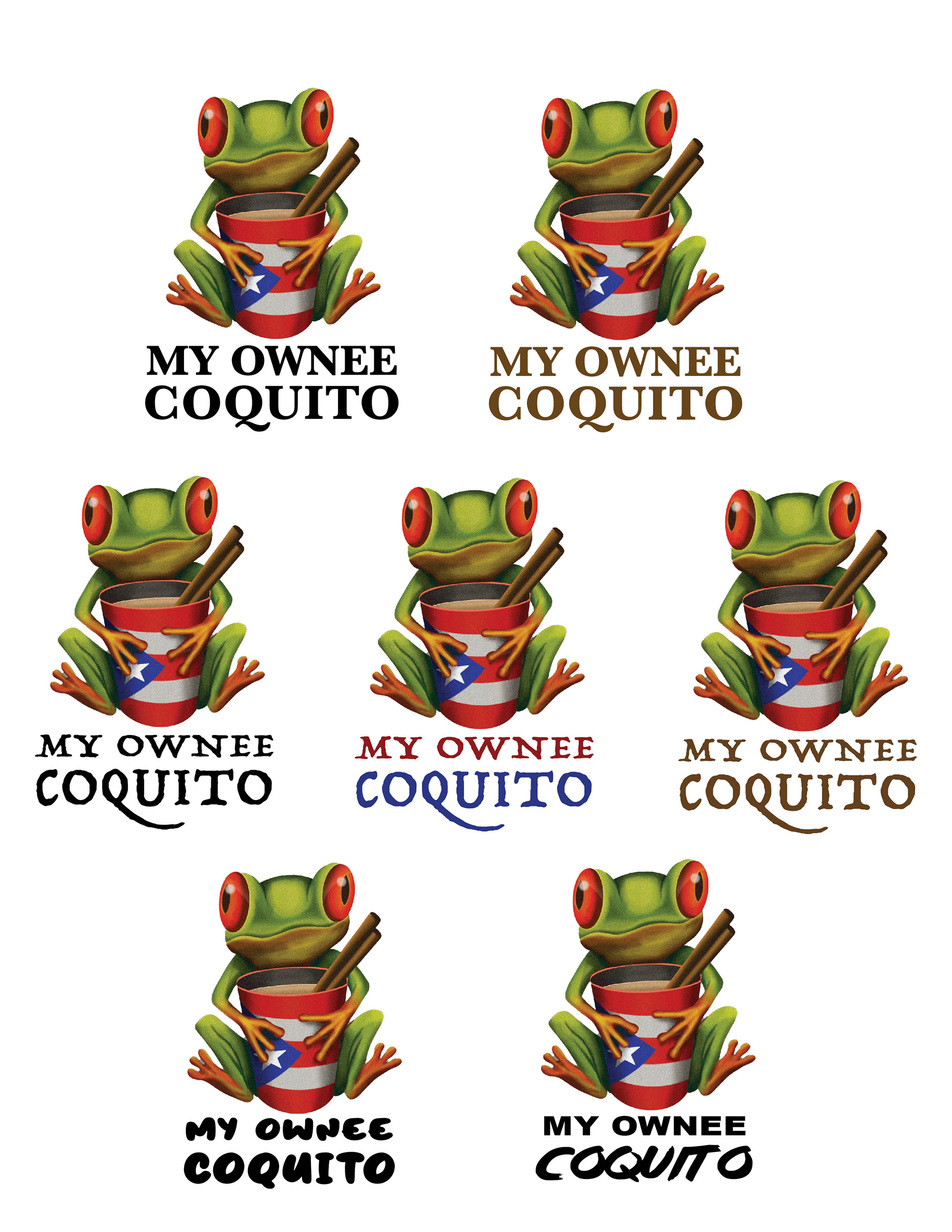
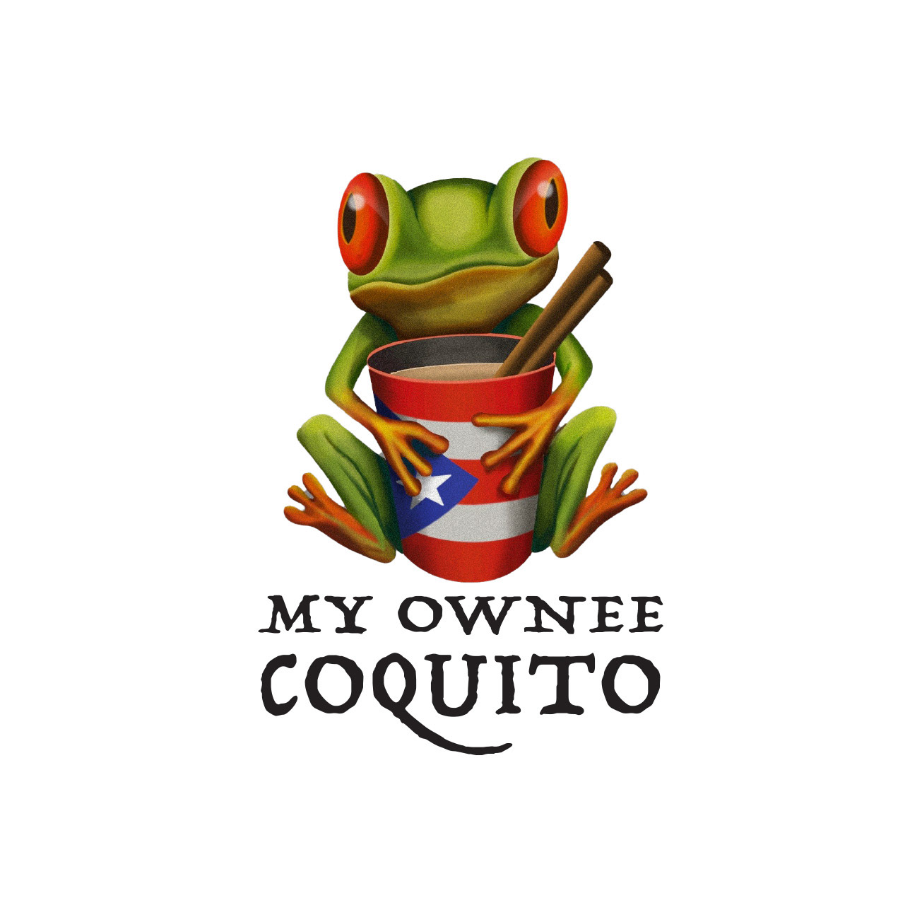
"My Ownee Coquito" is a local small business that sells Coquito, a traditional coconut-based Puerto Rican drink similar to eggnog. The client provided me with a mood board of elements he wanted: the Puerto Rico flag, frogs, and patriotic colors.
So I started with black and white ideas that incorporated said elements:
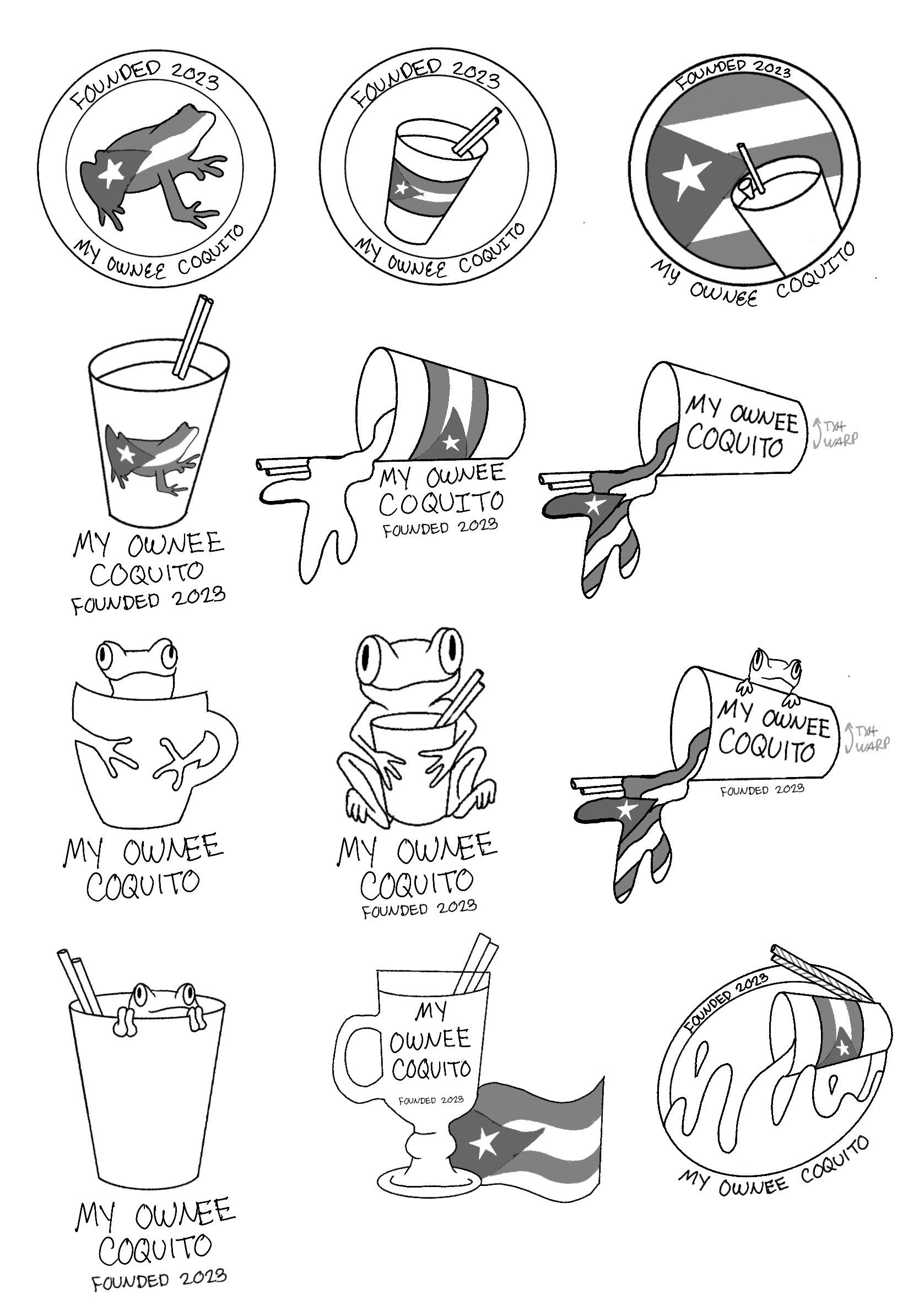
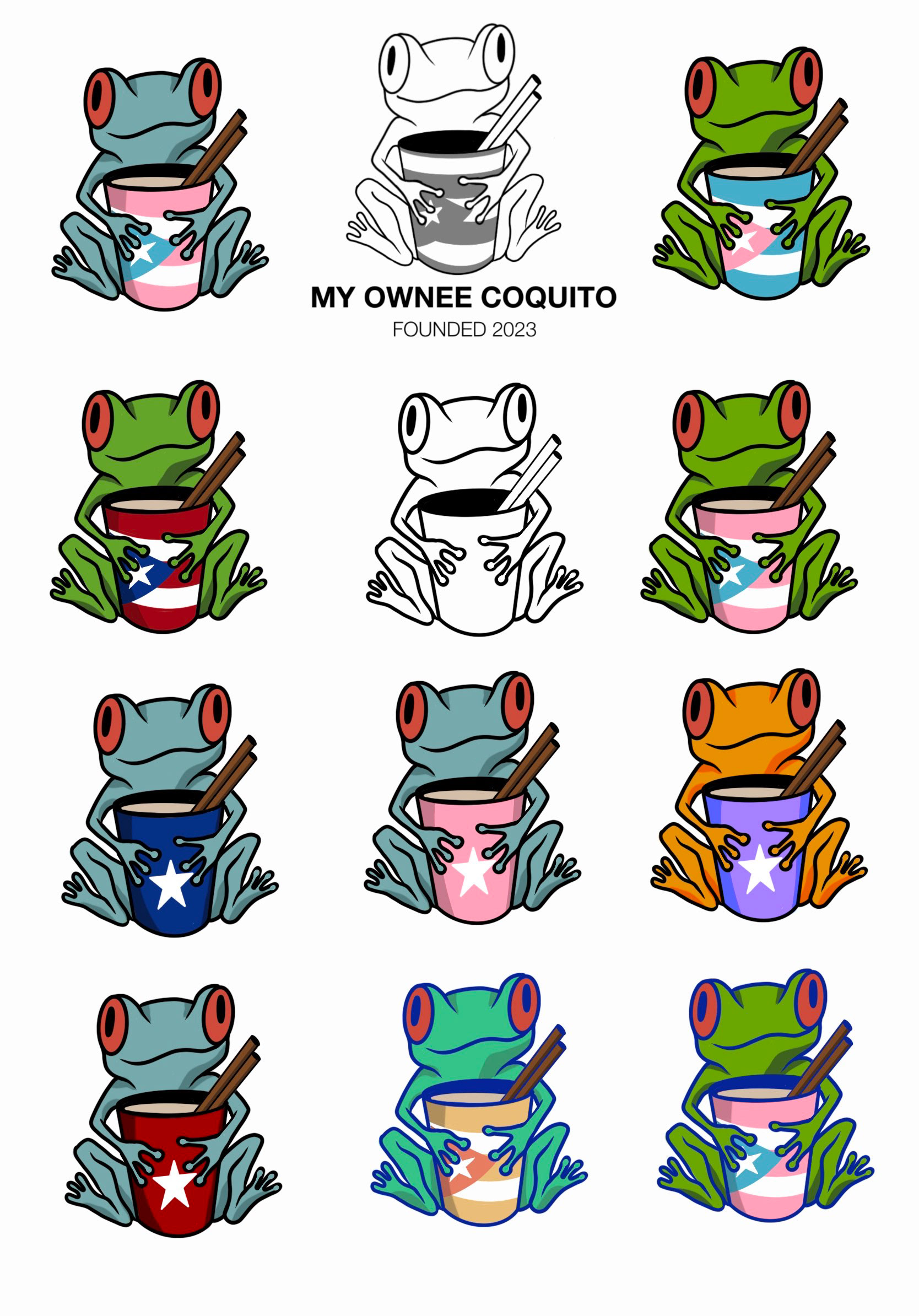
Once the client chose a design, I went ahead and started to experiment with color.
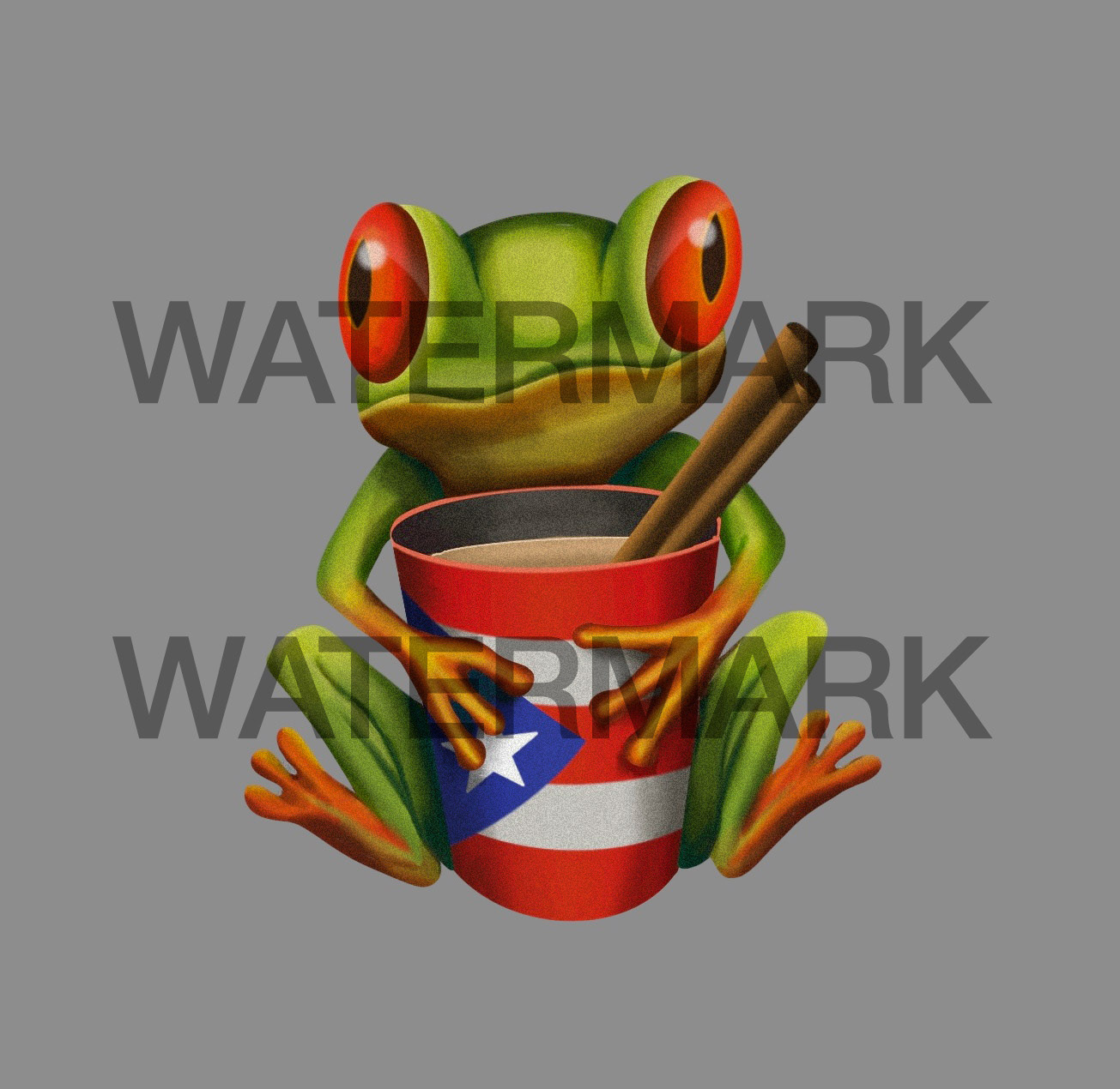
The client ultimately chose traditional, realistic colors, and requested it be illustrative and texturized rather than a vector image:
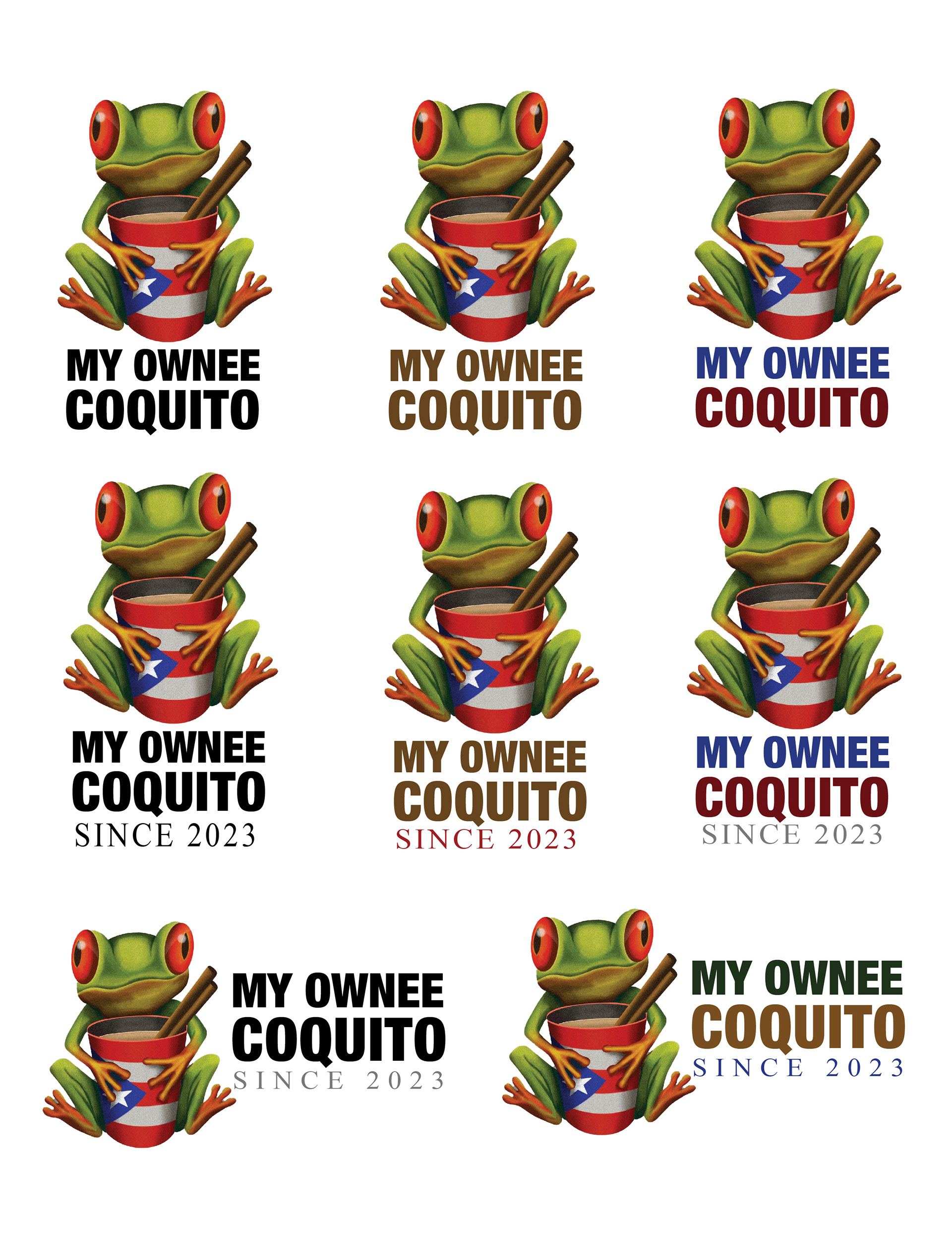
Now that the illustrative aspect was done, all that was left was the type. I experimented with different typefaces, kerning, and color.
The client decided to get rid of the "Since 2023", and so ultimately I chose the type that best fit the aesthetic of the icon (Typeface Trattatello, Regular), resulting in the final logo.
L Business Multiservices
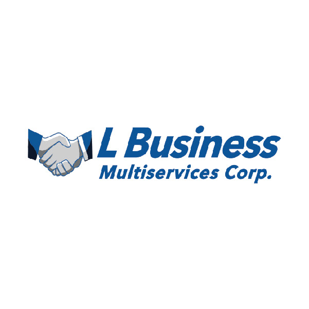
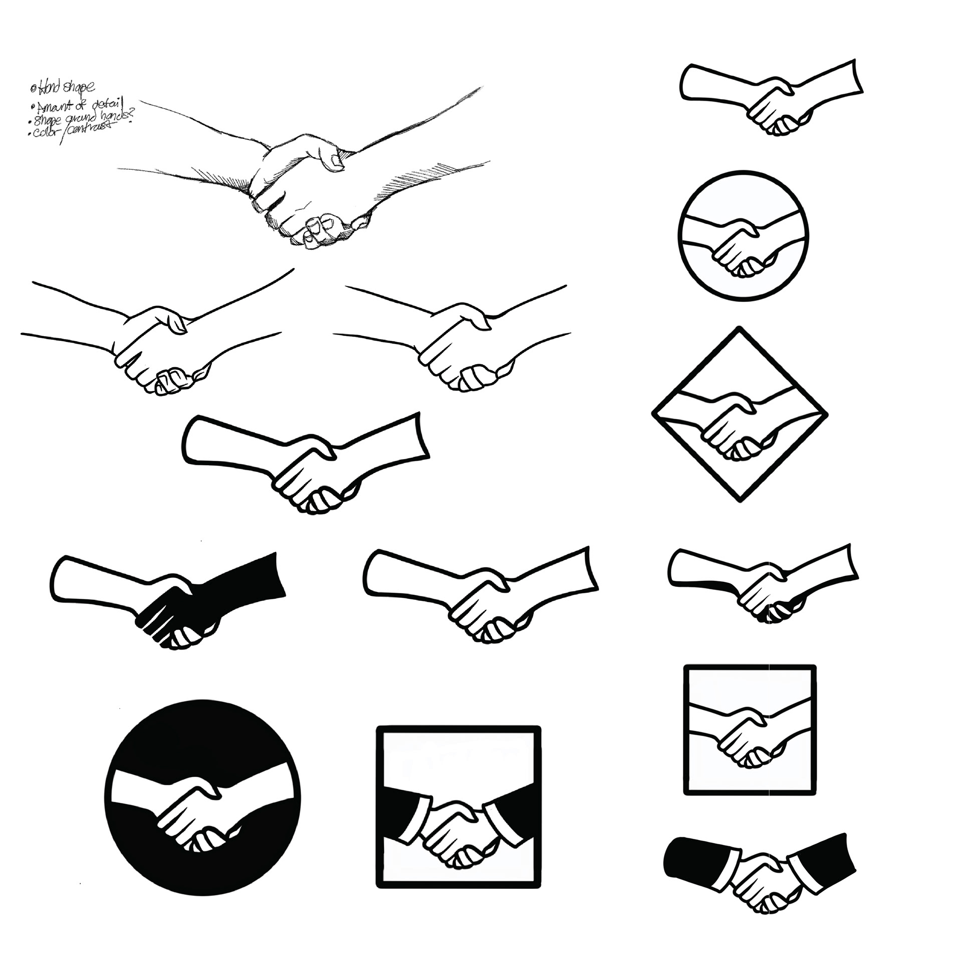
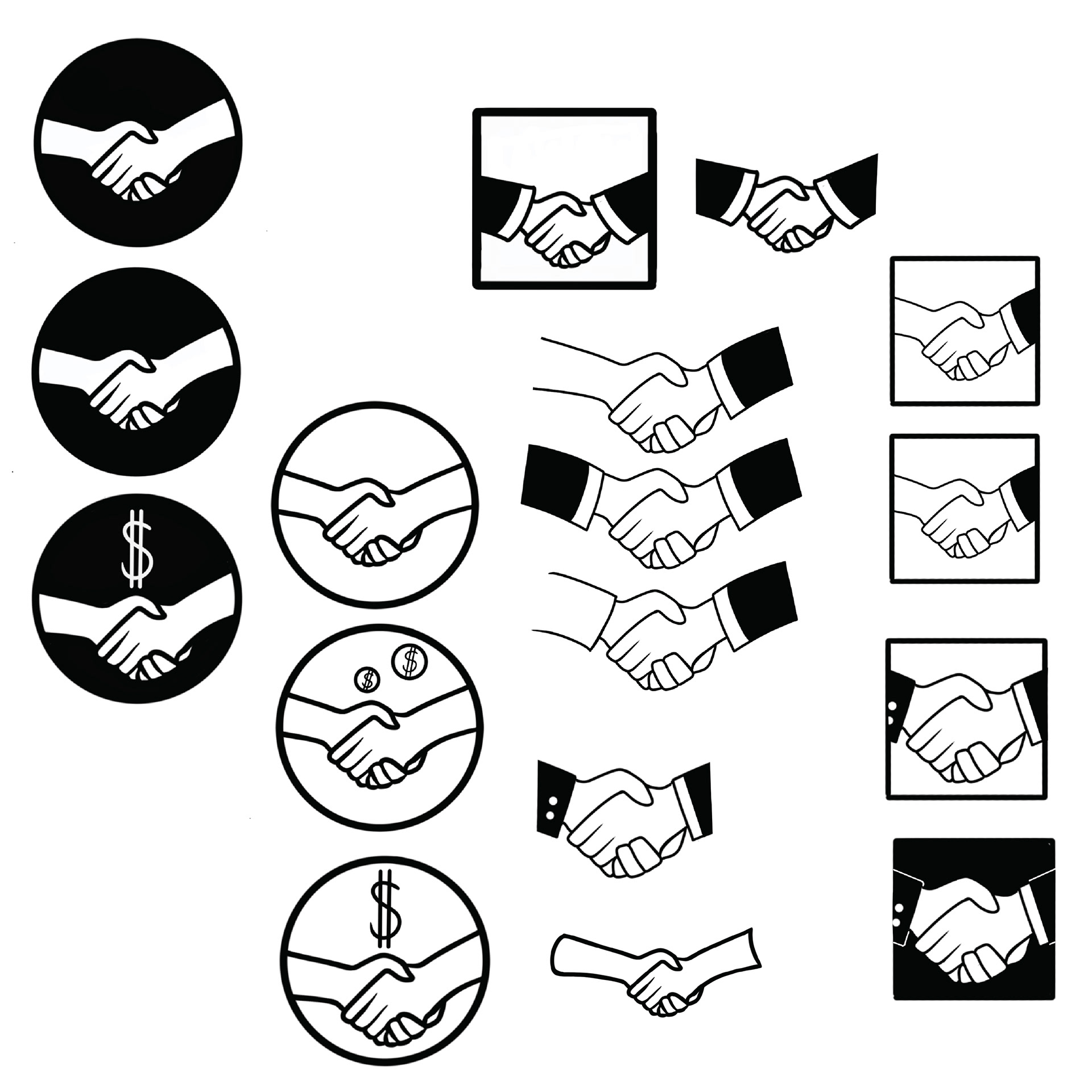
L Business Multiservices is a local small accounting business. The client wanted something simple and professional, and had mentioned the concept of two hands shaking.
After experimenting with different compositions, I landed on a simple vectorized image that would be used alongside text, along with two different color schemes.
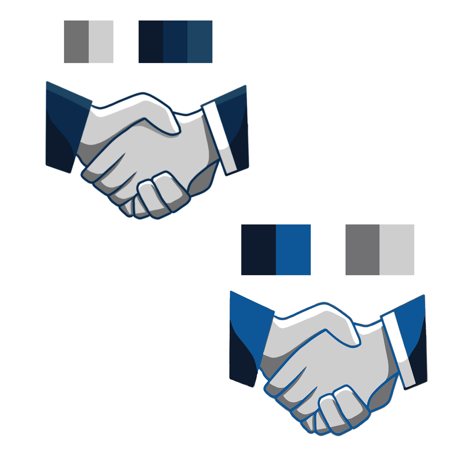
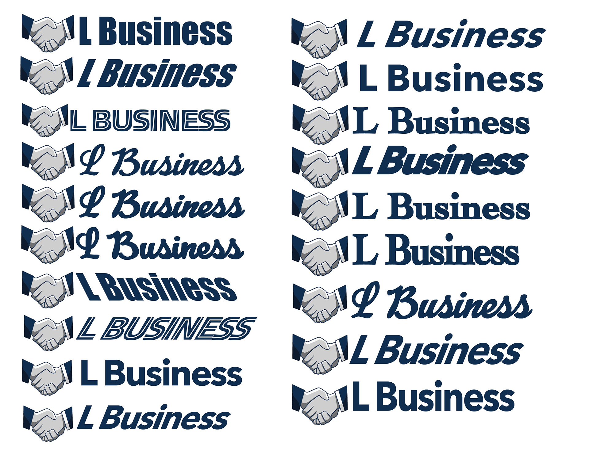
With an established icon, I proceeded to experiment with various typefaces to match it. The client specified she wanted something simple, so I settled with a sans serif font (Avenir Next Bold).
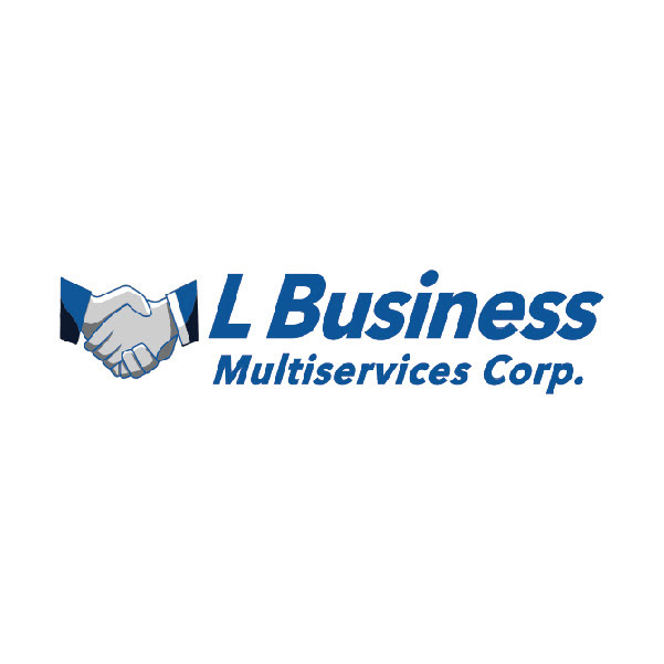
I made it the same shade of blue as the sleeves of the hands and tested how it would look on different backgrounds for the website, thus completing the final logo.

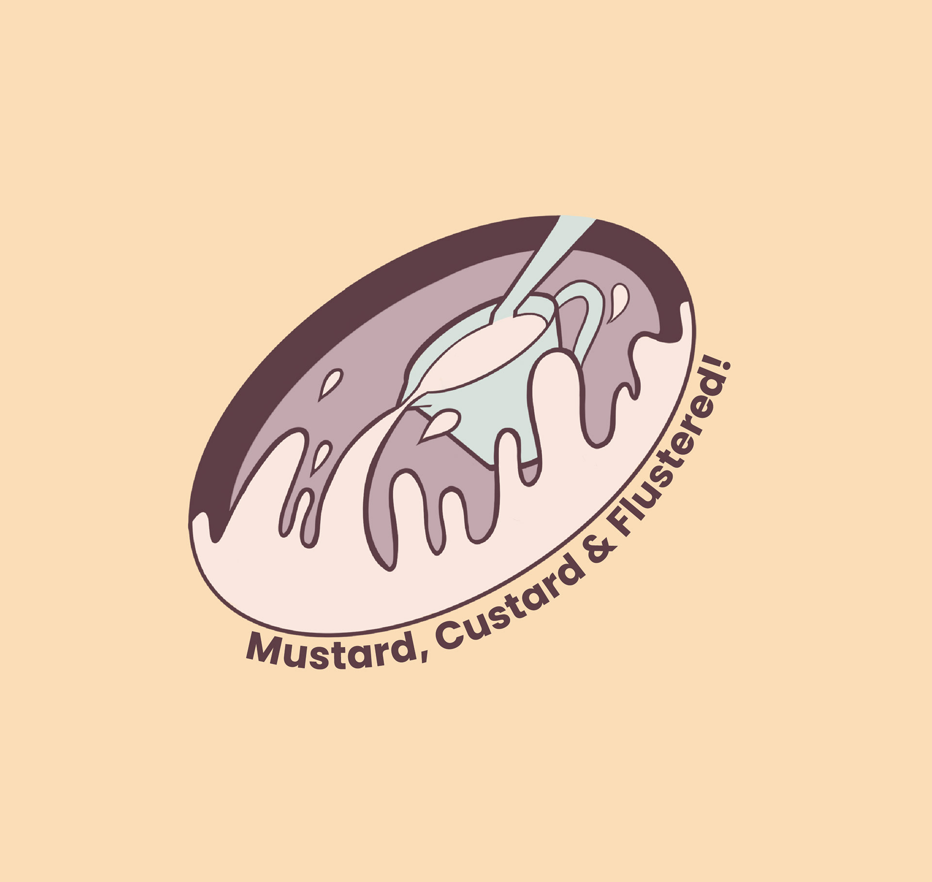
Mustard, Custard, & Flustered
"Mustard, Custard, & Flustered" is the name of a hypothetical sweets shop. This was for a semester-long Communications Design project of creating a singular logo for a fake company.
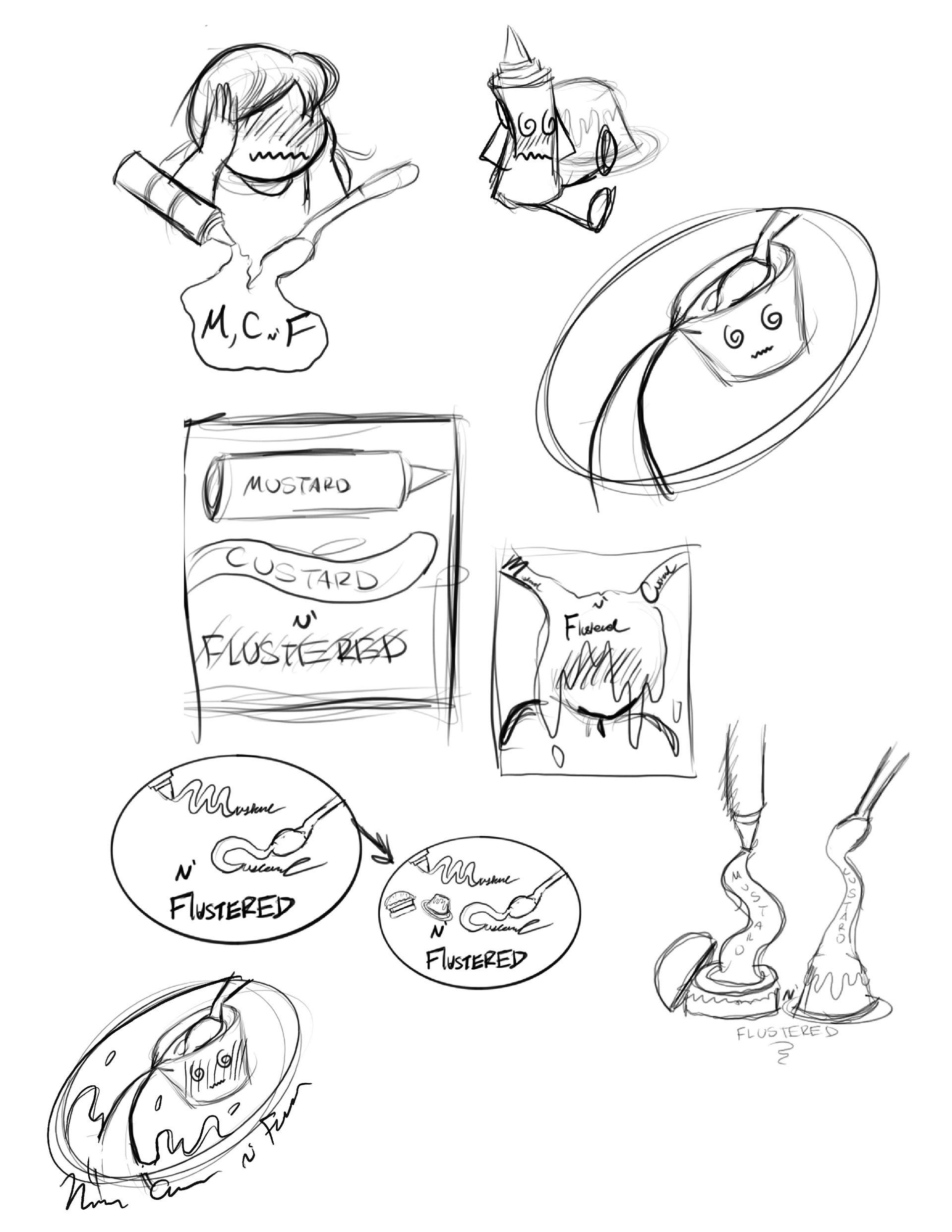
After creating a name, the first step was to sketch out rough ideas.
Once I had a clear idea, the second step was to clean up composition strictly in black and white.
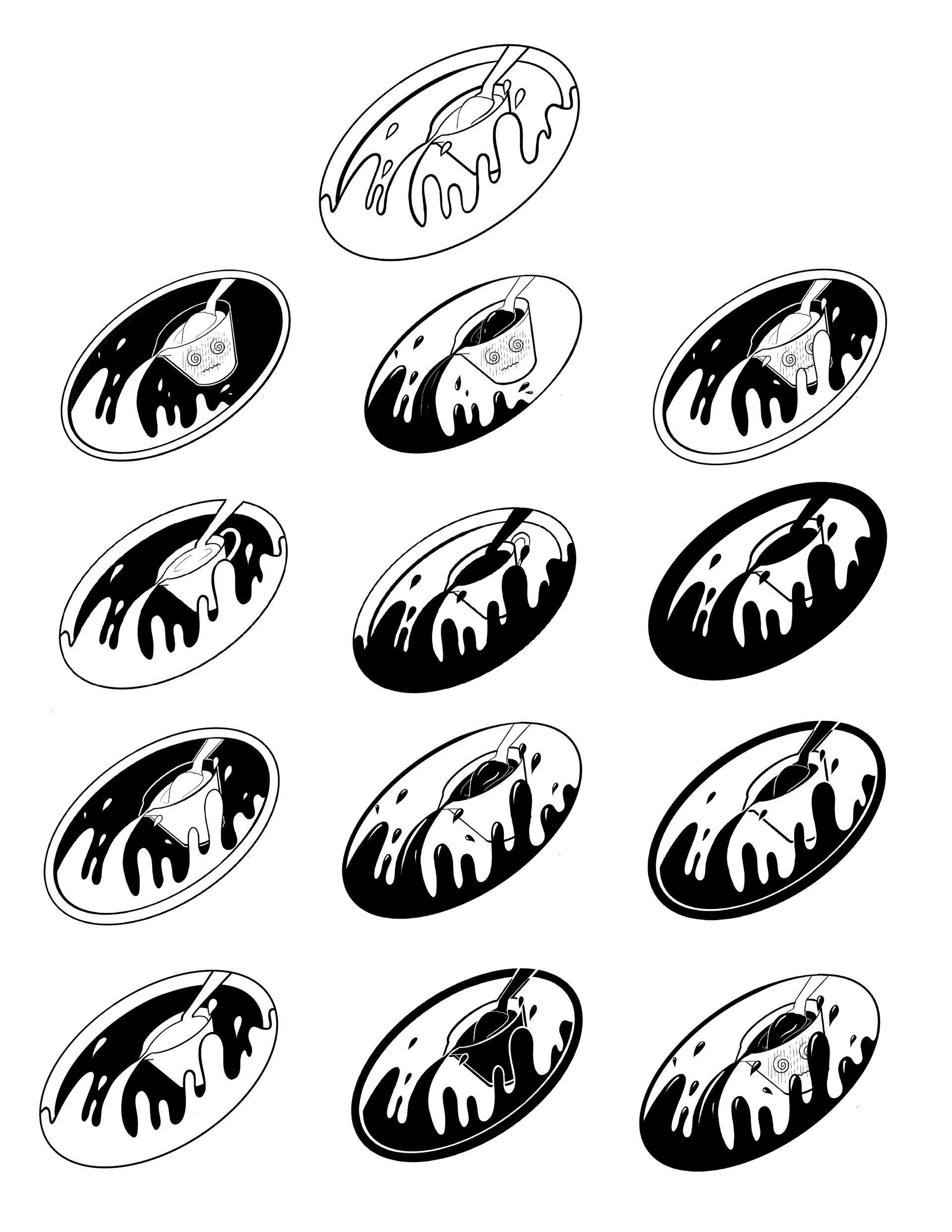
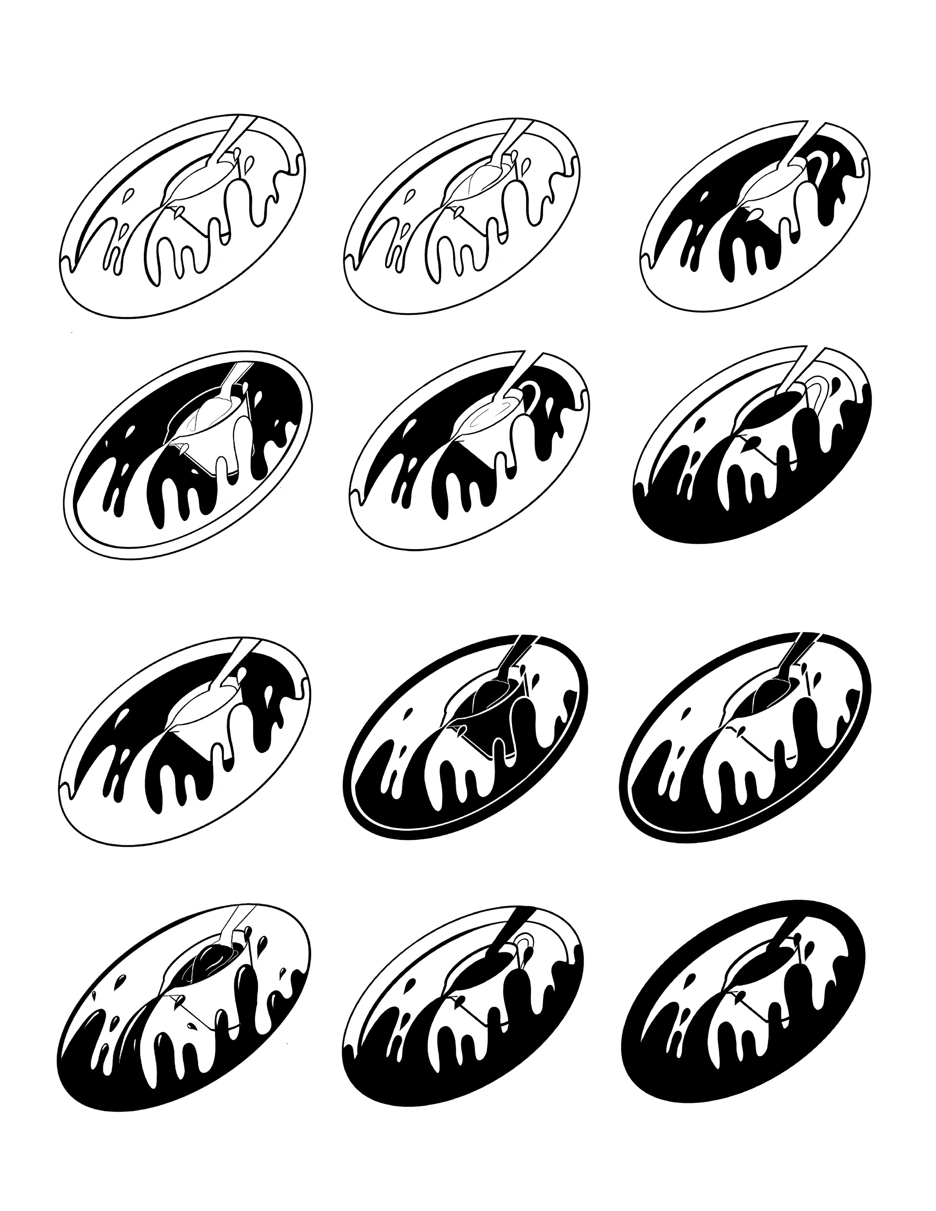
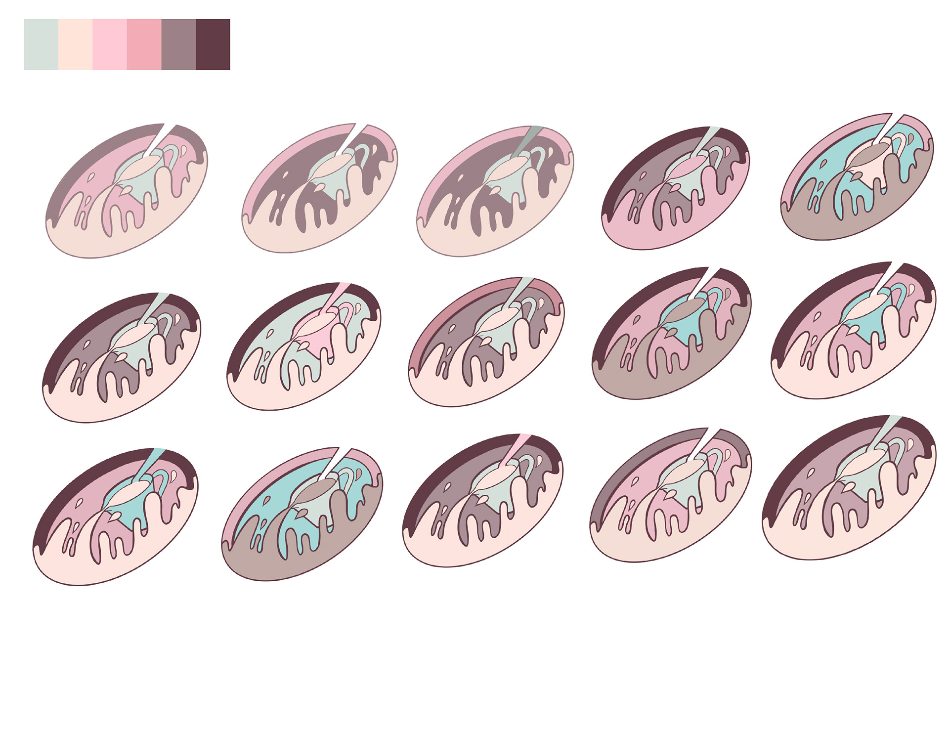
Once I had a clear composition in black and white, I then experimented with color using a strict color palette. After much trial and error, I ultimately had clean and balanced color scheme and completed logo.
